Overview
In the modern, technological age, every advisor will tell you that you need an online presence. Granted they're usually referring to fully fledged businesses, but it can't hurt to have a personal website. These days, a CV is not enough to show off who you are as a person, what skills you have, and what you have achieved, so it's important to have somewhere employers or other interested parties can find out more.
Therefore I set out to crate a website that would allow me to show off who I am and what I do, in greater depth than a CV could. There were a few things I wanted the website to be able to do. It should:
- Provide information about who I am and what sort of person I am
- Allow people to view a curated list of the projects I've undertaken, whether for work or fun
- Provide a way for people to contact me
- Work well on a range of devices, so anyone can access it
On top of this I wanted the website itself to be a way for me to display my wide range of abilities, so I decided to code everything from scratch, and to set up my own web server.
Process
I started off by reasearching good website designing tools so that I could get an idea of how I wanted the site to look, before I spent the time creating it. While there are a lot of great online website builders (such as Wix or Squarespace), I wanted something that wouldn't result in a usable website, but rather a functioning prototype I could start coding. In the end, I found two potential programmes, Mobirise and Adobe XD. Mobirise is an offline website designer, aimed at non-techincally inclined people which uses premade "block" to allow the user to quickly and easily produce a webstie. While this is closer to what I was looking for, the free version of the software was fairly limited, and the overall product was fairly restricted by the design blocks they provided.
This then left Adobe XD. Adobe XD is not a dedicated website designer as with the other options, but rather a universal UX design tool predominantly meant for creating web or mobile apps. This meant that I could easily create a mock up of the precise design I wanted, while also testing how it would flow by using the in built interactive prototyping tools. Using Adobe XD, I created two designs for the website, one to use on desktop screens, and one for mobile.
The next step was to take this mock up design, and convert it into the code for the final website. I wanted to maintain control over the website, and to gain a deeper understanding of the core of web development, so I opted to stick to pure HTML, CSS, and JavaScript where possible. Where not possible, or simply to make life slightly easier, I also used Bootstrap and JQuery, as these could make coding the site much quicker and simpler, without giving up the fine control I wanted.
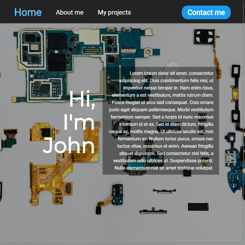
The core design of the website is based around four tabs. This allows me to separate the various sections of the site and keep everything looking neat and clean. The traditional way to accomplish this look, would be to have four separate webpages and to have the navbar at the top contain links to each page. However, this approach causes the entire page to reload whenever a new tab is selected, which felt cumbersome and outdated. So I turned to bootstrap, more specifically to the tab feature. Bootstrap tabs allow you to have a navigation bar that controls a content area and fades nicely between content when the appropriate tab is selected. Almost perfect! The biggest issue was that each of my tab designs had a different background across the entire page, whereas bootstrap tabs only control a portion of the screen.
To get around this limitation, I split each tab in to two parts. One <div> tag containing all of the content of the page shown below the navigation bar, and One <div> tag containing the background image. The content was set to use the standard bootstrap tab system, but the images had to be controlled with additional JavaScript programming. A function was set up to occur whenever a new tab was selected, it grabs the new tab, and the current one, and controls the fading of the background images to ensure that there's a seamless transition to the new tab. This produced the desired effect of each tab appearing as a completely new webpage, while never completely refreshing the page, and allowing for smooth fading between each section. All that remained with the navigation bar was to improve the look of the default navigation bar. None of the bootstrap options fitted the aesthetic of the rest of the webiste, so I completely rewrote the design using CSS and, where needed, the !important command to ensure that my design choices overruled the bootstrap design.
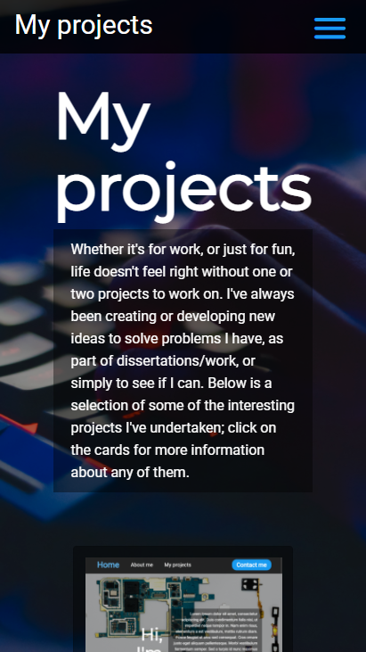
One of the major design points I wanted to focus on when developing this website, was to ensure that it functioned well across a range of devices with varying screen sizes. To accomplish this, I designed two separate, but similar, layouts, one for mobile devices and one for desktops. The mobile site is more focused on touch inputs with larger buttons, a more vertical layout, and a separate navigation menu, whereas the desktop site has a more horizontal layout, smaller buttons, and a navbar permanently along the top of the screen. To break it up further, and to ensure most devices can nicely display my site, I added multiple media queries in css to detect the screen width of the device accessing the website. These queries cause both the main change between the desktop and mobile site, and smaller changes such as font size and positioning of elements on the screen. Finally, to make sure the site still looked good between the media query breaks, as many values as possible for position and size were based on the screen size using css units such as vh ,which is one percent of the screen height, and js functions to position elements precicely, ensuring that they responded to the changes in screen size smoothly between the breaks.
While it would have been simple to buy a web hosting service, possibly even with the registrar I bought my domain from, I wanted to have a deeper understanding and control over how my website is hosted. Initially I had my website hosted on gitpages free hosting system for testing, but when I decided to finalise the website, I chose to rent out space on a VPS (virtual private server) from OVH. On this VPS I set up an apache web server to serve my website so it can be accessed from anywhere, there was little to no reason that apache was chosen over the alternatives such as nginx , besides the fact that it was the first option I happened upon. To ensure web browsers wouldn't flag my site as a hazard, I had to generate some ssl certificates which were done using certbot. To allow people to access certain files for my projects, such as cad files or the code used, I set up a simple file server through apache as well, allowing me to like to a locked down file store of project files, without granting access to the entire server storage. Lastly, to avoid having to ssh into the VPS and writing all the code in vi or nano, or manually transfering the files each time I want to make a minor change, I set up a cron job to pull any changes from a git repository, so all I have to do to update the site, it to push a change to my git repository, and the website updates within a minute.
The last feature to put on my website was the contact form. While having my contact information on my website is a good way to allow people to contact me, it requires people to leave the site or have set up a linked in profile. To make this simpler, I added a simple form to fill out containing the name and email address of the person wishing to contact me, as well as their message. This was done using a simple javascript function to reset the form, as well as a PHP script to process the data and send the message to me. To make it easier, I set up a spare email adress, sending@johnhawk.tech, to email these messages to myself via the PHP script.
Outcome
From the first idea of the website, to the final product, there were many hurdles and issues that I had to overcome. Some of these were fixed with elegant solutions, other by subtly changing the design in a way that wouldn't affect the final outcome, and the majority with less than ideal bodges. This led to a website that functions as I want on the surface, and in the majority of cases no-one will notice any of the issues, but for some fringe cases (such as very specific screen sizes) various bits break for unknown reasons.
While the number of shortcuts and bodges wouldn't work for a professional design, they work perfectly for the site I was trying to create. In the end, only half of the purpose of this site was to act as an online presence for me, the other half was for me to learn about web development and web hosting. After this project, I not only have a functional website, but I have learnt a lot about good web development practices and how websites themselves are hosted, so it has been successful on both fronts.
If I were to redo this project, I would have designed the website with everything I have learnt in mind, such as designing the site to be mobile first to make it more responsive, or creating a navigation system from scratch rather than butchering the system from bootstrap. Overall, I'm very pleased with the outcome of this project, and hope that it stays functional for many years to come.
Last Updated: 09/01/2021